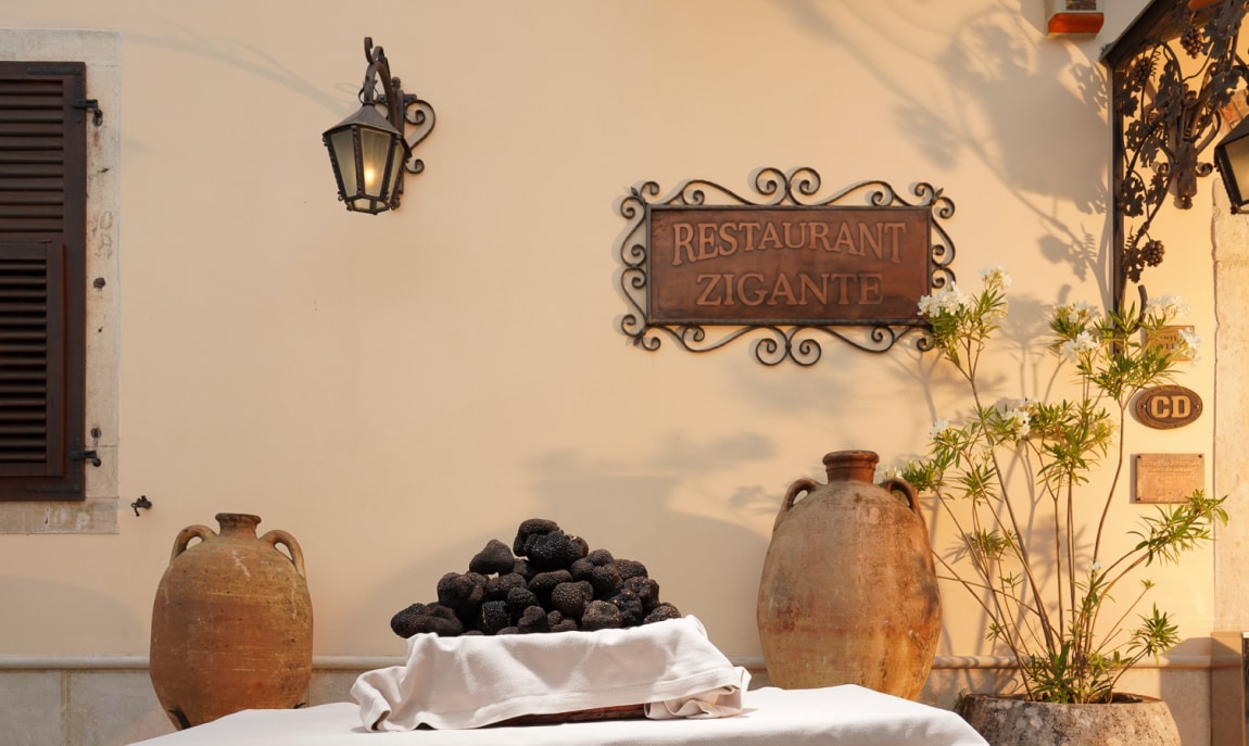
RESTAURANT ZIGANTE
UX/UI DESIGN
ABOUT THE RESTAURANT
Restaurant Zigante stands as a symbol of exquisite taste and culinary mastery. Specializing in truffle-infused dishes, the restaurant offers a blend of traditional Istrian and Italian cuisine, innovatively crafted to create a unique dining experience. The emphasis on quality, elegance, and luxury reflects the essence of Zigante's brand.
CRAFTING ELEGANCE
Attention to detail was key in handling the technical aspects, ensuring a user-friendly experience that resonates with the themes of truffle and high-end dining. This project was an opportunity to explore the art of design, transforming an idea into an experience that speaks to the heart of luxury dining. The result is a website that not only looks beautiful but also serves as an authentic representation of Restaurant Zigante's values and vision. It's a celebration of culinary excellence, crafted with care and a genuine love for the craft.
THE DESIGN PROCESS
The itterative design process consisted of a flexible flow with following main stages:
- • Design Brief
- • Moodboard
- • Wireframe
- • UI Design
- • Prototype
By filling out the design brief I outlined the goals, quality and deliverables of the project. The filled out document had all the relevant information about the tone of voice, target audience and scheduled sessions. This helped a lot later during the process by solving all uncertainties. After generating some initial ideas trough sketching and examining how other designers approach a similar challenge, I had a nice basis for developing the wireframe and later on designing the UI. A prototype was later introduced to examine how the complete product felt, and was finally ready for development. I added hover effects and click events in the prototype, so the developer could easily transform my vision into code.
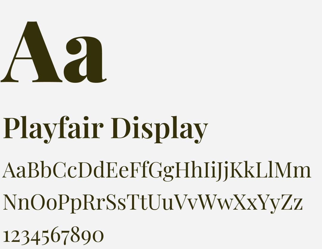
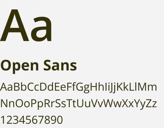
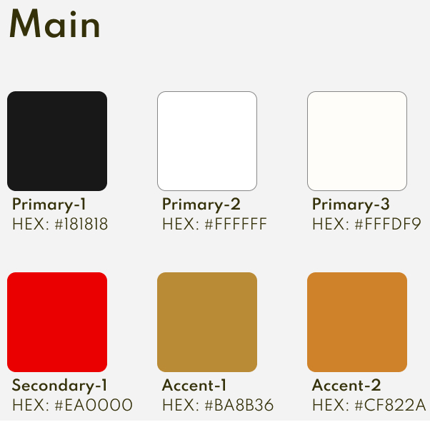
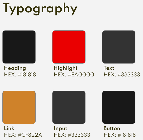
STYLEGUIDE DEVELOPMENT
During the design phase I carefully crafted a modular design system with complementary colors and typography adhering to the branding guidelines.
THE MINIMALIST APPROACH
The minimalist design created a welcoming digital space, reflecting the essence of Zigante in a way that feels both unique and inviting. By embracing a restrained color palette, clean lines, and thoughtful spacing, the design created a digital space that resonates with the brand's unique identity. This minimalist framework allowed the culinary artistry of Zigante to shine, offering an undistracted celebration of taste and quality. It's a reflection of the belief that true elegance often lies in simplicity, and that less can indeed be more.
A JOURNEY TOWARD EXCELLENCE
The Restaurant Zigante project was guided by a clear vision and a dedication to quality. From the start, the focus was on aligning every design element with the brand's unique identity, without losing sight of the elegance and luxury that define Restaurant Zigante.