TEMPUS MEDIA
UX/UI DESIGN, WEB DEVELOPMENT
FLAWLESS DIGITAL SOLUTIONS - A REDESIGN STORY
Tempus Media is a digital agency specialized in marketing and web development. The website redesign is one of those projects where you have very few obstacles to employ complete creative output. That was the beauty of it. From creating a unique and detailed design system, to hand picking the stack - this project was lovely to work on from the start.
TECHSTACK USED
NUXT
VUE
TAILWIND
WORDPRESS
FIGMA
THE DESIGN PROCESS
The itterative design process consisted of a flexible flow with following main stages:
- • Design Brief
- • Moodboard & Sketching
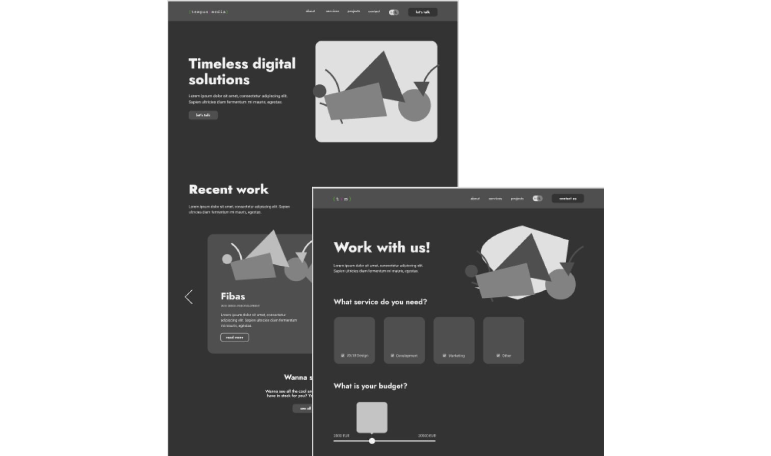
- • Wireframe
- • UI Design
- • Prototype
By filling out the design brief we outlined the goals, quality and deliverables of the project. The filled out document had all the relevant information about the tone of voice, target audience and scheduled sessions. This helped a lot later during the process by solving all uncertainties. After generating some initial ideas trough sketching and examining how other designers approach a similar challenge, I had a nice basis for developing the wireframe and later on designing the UI. A prototype was later introduced to examine how the complete product felt, and was finally ready for development.
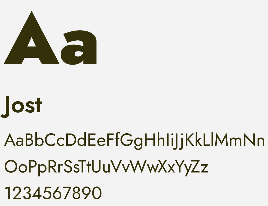
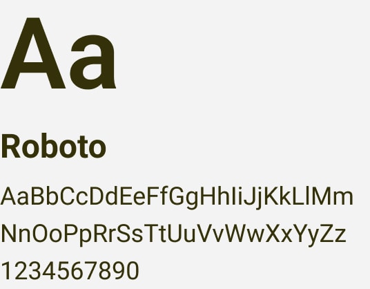
STYLEGUIDE DEVELOPMENT
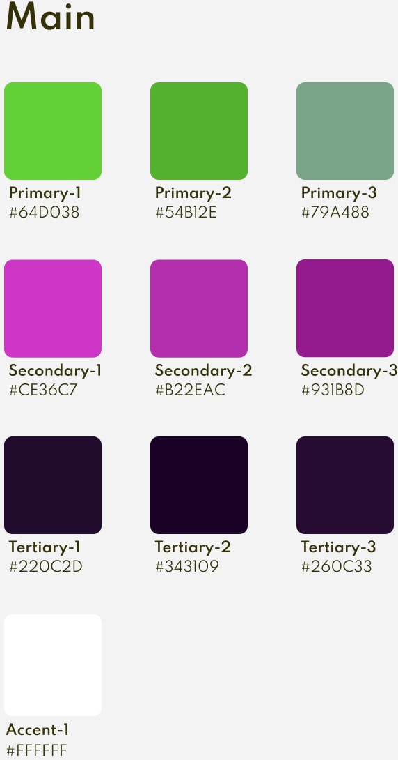
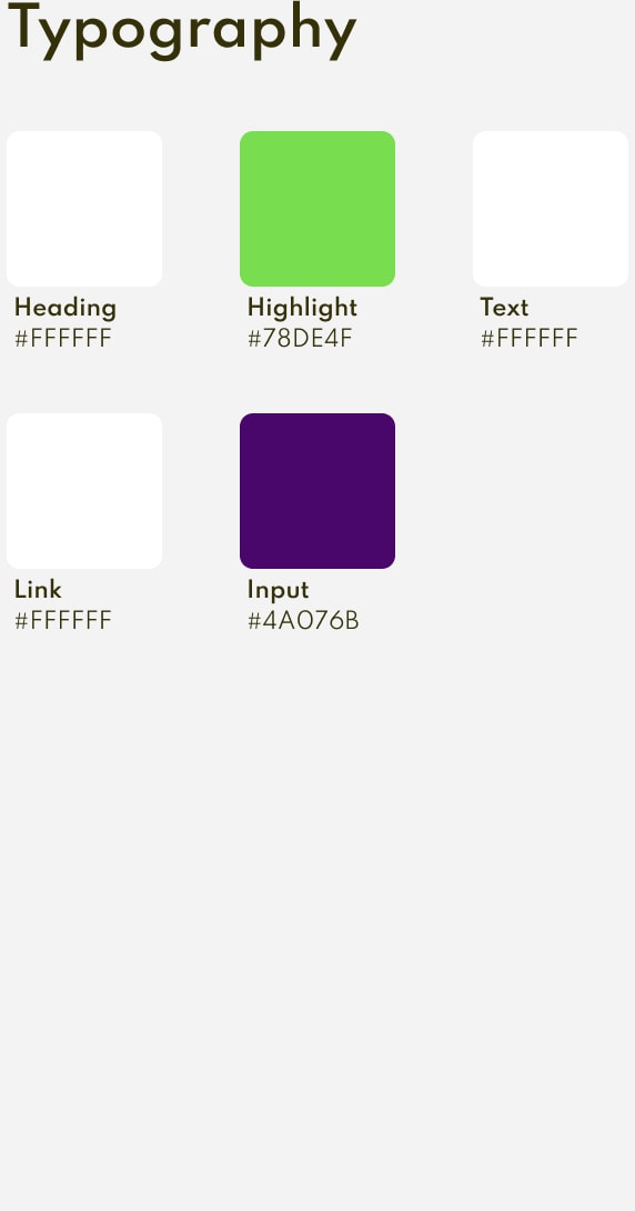
During the design phase I carefully crafted a modular design system with complementary typography and colors adhering to the branding guidelines.
GLASSMORPHISM & DARK LAYOUT
Glassmorphism is a style represented by transparent elements with a frosted-glass effect creating an immersive experience for the user. Combined with the dark layout spread trough the web it generates a feeling of spaceiness and visual interest.
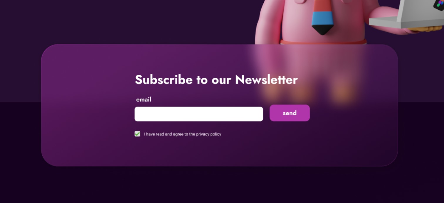
*An example of glassmorphism element overlapping illustration on dark layout
LAPTOP-SCREEN PROJECTS SLIDER
An especially interesting undertaking was developing the laptop-screen projects slider prominent just underneath the hero section and developed using VueSlickCarousel.
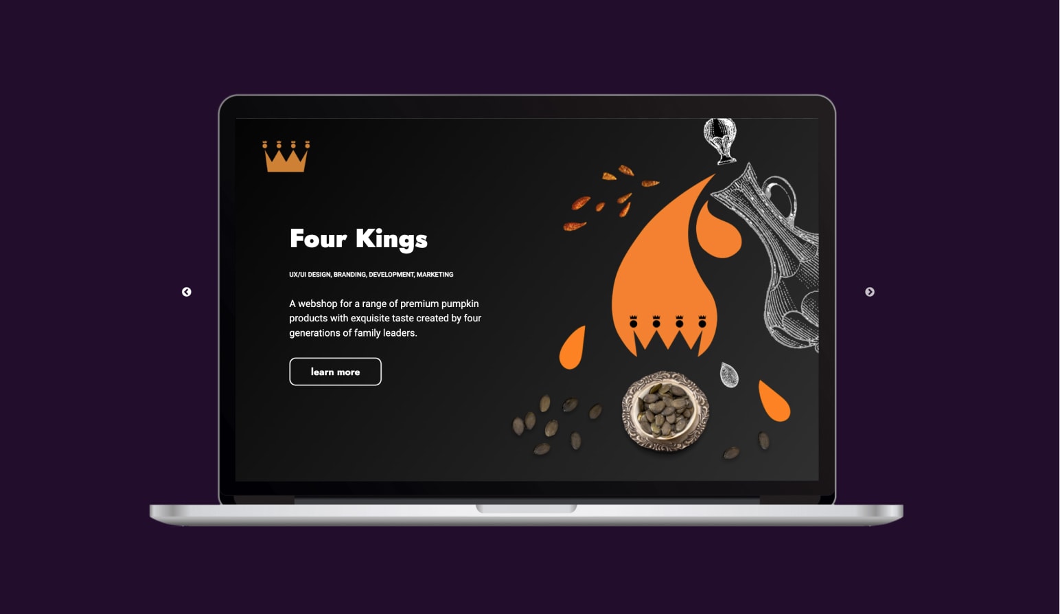
*The Laptop-Screen Projects Slider
HEADLESS WORDPRESS FOR BLOG
Since the content of the blog section had to be easily managed, WordPress was the perfect solution to be used as the headless cms. The content was then fetched using the Axios Nuxt Module.
SOMETHING DIFFERENT
This project helped me establish previously gained knowledge and implement it in a fluent way. In the development phase, using the Nuxt Modules made plugins integration much more enjoyable. Using shortcuts in Figma, and having a smooth flow by creating reusable components and setting up the grid system helps create crisp designs. I’ve approached different design and development challenges by trying to have a free and calm mind which allowed me to put myself in the skin of various users and the WOW-Moment they would feel when exposed to a novel aesthethical choice.