MANŠPED
UX/UI DESIGN
THE POWER OF EFFICIENT TRANSPORT
Manšped stands as a testament to the power of streamlined logistics, smart strategies, and collaborative teamwork. As the driving force behind business success, Manšped offers a range of services, from intermodal solutions to ocean transport, ensuring efficiency and cost-effectiveness.

THE DESIGN PROCESS
The itterative design process consisted of a flexible flow with following main stages:
- • Design Brief
- • Moodboard
- • Wireframe
- • UI Design
- • Prototype
By filling out the design brief I outlined the goals, quality and deliverables of the project. The filled out document had all the relevant information about the tone of voice, target audience and scheduled sessions. This helped a lot later during the process by solving all uncertainties. After generating some initial ideas trough sketching and examining how other designers approach a similar challenge, I had a nice basis for developing the wireframe and later on designing the UI. A prototype was later introduced to examine how the complete product felt, and was finally ready for development. I added hover effects and click events in the prototype, so the developer could easily transform my vision into code.
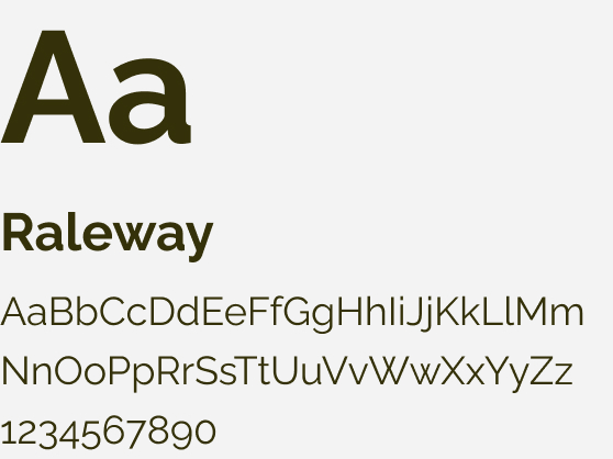
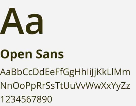
TYPOGRAPHY
During the design phase I carefully crafted a modular design system with complementary typography adhering to the branding guidelines.


A FOCUS ON USER EXPERIENCE
With branding keywords like minimalist, unique, trustworthy, smooth,
and capable, the emphasis was on delivering an impeccable user
experience. The challenge was to present Manšped's diverse services in
an organized and intuitive manner, ensuring users find what they're
looking for with ease.
The most challenging aspect of this project was categorizing and
showcasing the plethora of services Manšped had to offer. From
intermodal solutions to warehousing, each service required a unique
approach to ensure clarity and user-friendliness.
CRAFTING A STORY
Words matter. For Manšped, I focused on crafting titles that went beyond the basics. I aimed for something more engaging. It's about making the user curious and inviting them to read on. A good headline grabs attention and sets the mood for what's to come.